UI/UX Industry Project
Dreami—Crafting web features to the mentorship platform
Dreami is a startup providing free platform that connects people to the mentors in their career. Since the platform was launched and users have been growing, the website needs to update new features to satisfy user’s needs.
Problem One:
The platform misses the message button
First, the platform needs a message button to let users communicate before and after meetings.
Solution:
After understanding user flow of Call to Action (CTA) buttons in the dashboard, we followed the existing design system to create the message button.

Problem Two:
Users ignore mentee guide icon and agenda icon
Two icons next to the Upcoming Session contain meeting agenda and mentee guide information. Users might miss the icons because of small sizes and the same colors with text copy.
Solution:
After understanding the site map structure, one of the solution is to create a resource button at the top navigation bar to store both information. The other solution is to keep the original location but optimize the design by using consistent action button color palette.
Case study in “Problem 02“ section.

Problem: mentee guide and agenda icons
The team
Over the platform of optimizing user experience, I worked with engineer (Dreami platform owner) and another UI/UX spring board student to identify, prioritize, and execute on the problem roots and features.
Tools
Miro, Adobe XD, and InVision.
Timeline
~5 weeks
Problem One
The platform misses the message button
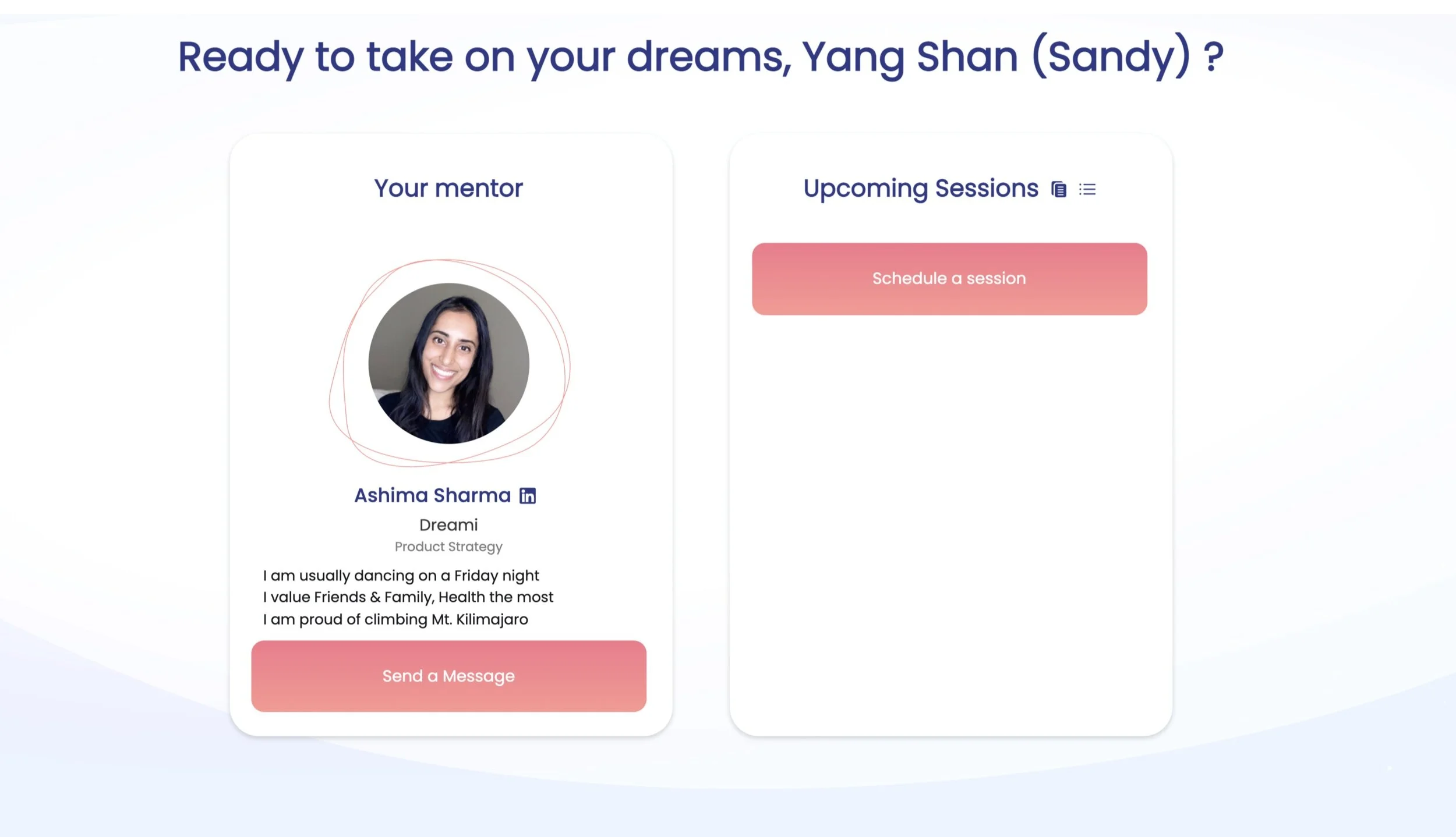
After the platform was launched with minimum viable product (MVP) features, Dreami Dashboard is the main place that users can schedule meetings with their mentors or mentees. To protect members privacy, users will only interact with each other through Dreami platform.
The problem is to add a message button into the dashboard to enhance user experience by communicating before or after meetings.

Dreami Dashboard without Message button
Design Requirement & Constrains
For this stage, the MVP requirement is to create a message button and a floating window to let user leave messages and send to the receiver. Users can’t see other people’s emails.
Mentor platform and mentee platform share the same interface design in the MVP stage. The case study will use mentee’s platform as a showcase.
Learning
Competitive Research
I conducted a competitive research to other platforms with mentorship function such as Springboard and Canvas.
Springboard
The platform shows “Send Email“ button. After users click the button, it will redirect users to their own email service with receiver’s email.

Canvas
In the tutoring page, the page shows professor’s email address with his or her profile picture. Users can copy the email address to their own email service.

Finding
Both platforms have high accessibility showing email information. They are easy to find out and access the information. The process is not complicated to make mistakes.
User Story
After the competitive research, I wanted to know what were the most important actions while sending out messages. Then, I wrote down user stories for both mentors and mentees sides.

Finding
Users should complete tasks easily with those two actions:
Find the message button
Send the message
Understanding
User Flow
We created a simple user flow to analyze numbers and objects of actions in the dashboard. The main action button is “Schedule a Session”. From the previous research, we concluded the message button will be another important action button in the dashboard. Therefore, we created the user flow with two important action buttons. “Schedule a Session“ and “Message“.

Making
Sketch: Message button
Following the user flow, we created two sketches with the message button based on the existing dashboard. The dashboard is composed by two units with profile information on the left side and upcoming session on the right side.

Sketch 01
In the left unit, we condensed profile information and placed the message button at the bottom following the right unit design pattern. The design includes visual flow Z pattern.


Sketch 02
In the right unit, we scaled down “Schedule a Session” button and placed the message button next to it. The design also includes visual flow Z pattern.
The down side is that two buttons will be smaller in mobile devices since they split half of the right unit’s width.


Prototype: Send a Message Page
After message button page, the next step is to type messages and send messages. Because of the MVP stage, the page only needs basic information to guide users to complete the action. Therefore, we created a high fidelity sketch for this page.

Synthesis
Usability Testing
After creating prototypes in InVision, we conducted 6 usability testing for above designs.
Finding
Button in the sketch 01 calls out more than sketch 02 because the size is bigger.
Button in the sketch 01 is underneath the person’s profile information where messages will send to, so users feel more intuitive to click the message button.
Users all complete the “Send a Message“ task.
Solution
Problem 02
Users ignore mentee guide icon and agenda icon
Two icons next to the Upcoming Session contain meeting agenda and mentee guide information. There are some problems about theses two icons.
Users may ignore these icons because of small sizes and the same color with content text.
Current space is not enough for further new information.
The problem is to optimize the current features.

Learning
Site Map
I created site maps to understand what are the information structure and information hierarchy in the platform.
Non membership vs. membership
In Dreami platform, only members can access the dashboard to schedule meetings, read agenda and mentee guide. There are two site map. One site map is for non membership. The other site map is for membership.


Finding
Comparing both site maps, members have privilege to access their dashboard to send a message, schedule a session, read mentee guide, and read agenda sessions information.
The research will focus on membership site map since only members have access for the resources.
Making
Design 01
Create a resource drop down button at the top navigation bar and move both resources, mentee guide and agenda sessions, into the resource button.
Advantages
Resources button will be easily seen since it is at the top navigation bar.
The website can add further information to the resources drop down button in the future.
Disadvantages
The hierarchy will be different to move up both resources. The team needs to rethink of the information relationship.
If the resources are not updated frequently, users will ignore the resources button after the first use.

Prototype

Design 02
The other ideation is to remain the icons placement and adjust the buttons colors. This way the site map structure will remain the same.

Original Feature Analysis

Prototype


Synthesis
Usability Testing
After creating prototypes in Invision, we conducted 6 usability testing for both ideations.
Feedback for design 01

Finding
Resource button is easy to see. No users miss it.
Users think resources belong to whole website instead of up coming session since it locates at the top navigation bar.
Feedback for design 02

Finding
Two testers don’t notice the button at the first glance.
Two users mention they will click the resource button before the upcoming session for preparation since the button is next to “Upcoming Session“ .
Next Step
During the five weeks industry project, I conducted the UX research to understand the root problems and come up with design solutions through collaboration. We are excited that the first challenge to add “message“ button is live in the platform. The next goal is to conduct A/B testing for resources designs to conclude the best solution.