
Yes, We Do!
Wedding Pastries Packaging
Branding (Product) & Packaging & UX Research
2020 Graphis New Talent–Silver

— Problem Statement
Wedding pastries in Taiwan are a traditional wedding gift that is originally from Guangdong, China. According to tradition, the groom’s giving of wedding pastries shows that he is respectful and takes his vows seriously.
Chinese traditional pastries are a cultural treat that the younger generation may not be familiar with and are likely to be at a loss when it comes to tracing back the history and purposes. This phenomenon can be easily observed in Chinese wedding pastry packaging: Luxury pastry packaging is expensive but has lost its traditional meaning.

“How do we re-introduce and educate young generations about the wedding tradition? ”
— Solution
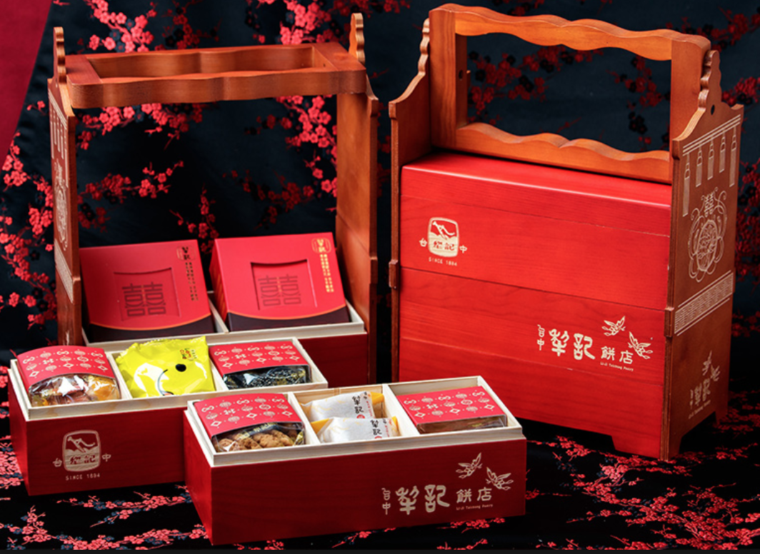
Yes, we do! re-envisions the traditional Taiwanese engagement ceremony with modern pastries and the traditional Chinese double happiness cake.
In the conventional Taiwanese wedding, the groom’s parents give engagement pastries to the bride’s parents, who share them with family and friends before the wedding day to share their joy. Yes, we do! addresses contemporary couples who might be a bride and a groom or a same-sex couple. Our brand conveys a joyful and fulfilled engagement with a modern interpretation of the eight steps of Taiwanese betrothals.
Targeted Audience
The target audience in Taiwan is young couples between 20 and 35 years old. The joyful brand will construct a romantic attitude of enjoying life together.

— Research
COMPETITORS
Yes, we do! shows the most meaningful features with a traditional red color palette and details of Taiwanese betrothals. Although the existing packaging is modernized and trendy, most people marvel at the excessive and unnecessary packaging surrounding it.
VISUAL LANGUAGE + MOOD BOARDS
- Red Color Pallet
- Mixture of traditional pastries and western pastries
- Inviting and accessible tone
- Resonance of Taiwanese and Japanese Cultures


— Ideation
THE MOST AUSPICIOUS NUMBER IN CHINESE CULTURE: 6 & 8
- The number 6 pronounced as 'Liu' means smooth and well-off.
- The number 8 has a similar pronunciation to 發 (which means wealth and fortune in Chinese).
I integrated the numbers 6 and 8 into the packaging design:
An octagon box has two layers. The top layer has 4 hexagon containers with western pastries and a booklet in the center square. The bottom layer contains Chinese traditional double happiness pastry.


Sketch
- Taiwanese culture: the mix of colonial architecture and traditional family–oriented culture.
- Red Color Pallet


Branding
After I did the illustrations, the branding came along with the styles. I brought sketches into Illustrator and InDesign by a combination of mood boards. This included logos, colors, and integration of a tagline.
LOGOMARK
The word mark Yes, we do! is a calligraphy font to fit into the inviting, accessible tone. The secondary branding points out the information of the product and the sans-serif wordmark keeps it simple and clear.
COLOR
Color cues are in red pallets to pass down the Taiwanese wedding tradition.
COMMUNICATION
Quality is the first and foremost characteristic audiences look for in a product.


Brochure
The idea of illustrations comes from the history of wedding pastries and the steps of the engagement ceremony. After refining the illustrations, I measured and created the wood box from scratch. The booklet documented each step of the illustrations.


— Learnings
I helped my brother prepare for his wedding ceremony back in 2018, but at the time I did not really know most of the Taiwanese wedding traditions. In preparation for this wedding, I had learned about the many unique cultural customs that make a Taiwanese marriage special. From this experience I became very amazed and proud of the ceremonial inheritance from our rich history. I wanted to create a new brand that shows the important steps of Taiwanese betrothals.
CREDITS
Art Director Kelly Holohan
Institution Tyler School of Art
© SandyChou 2025